Hi there! We are Gusi-Lebedi studio and we would like to share our experience of creating a logo for CPAHub.
Who did we do this work for?
CPAHub is a company, engaged into lead generation. Its major segment is formed by banks, microfinance providers and other financial institutions. The financial affiliates network attracts clients to banks, applying CPA.
What was the task?
We needed to create a new, distinctive and simple logo that would be different from the old cacophonic CPAHU one.
The client wanted something abstract, consisting of geometric patterns to distinguish itself from competitors in different business segments.

Solution: Hint at the adult service
The first concept included the preferences of the client. We wanted to design a symbol that would consist of two elements with the third one crossing them.
We decided to divide the word into two parts, keeping a logo in its original English options, adding come colours.

The logo was quite simple. Nevertheless, we faced another issue. The word Hub has very specific associations in the minds of Russian speaking people.
It was very appealing to try and apply the style of the adult video website. That is the reason the second variant of the logo got its well-known visual effect. But it is hard to call this signage unique.
This option was not among the selected ones as it was not clear how to adapt it to other businesses. And it implied undesired connotations towards company’s business.

About Switzerland and magnets
It was clear that a symbol must be simple but still incorporating a visual metaphor, which could be applied separately from its text part.

There were minimalistic options and designs close to the old signage.
We decided to apply another approach. What is the company engaged into? Lead generation.
What is first thing that comes to mind? A lead magnet! That is the term used in marketing to describe a product that attracts potential customers and clients.
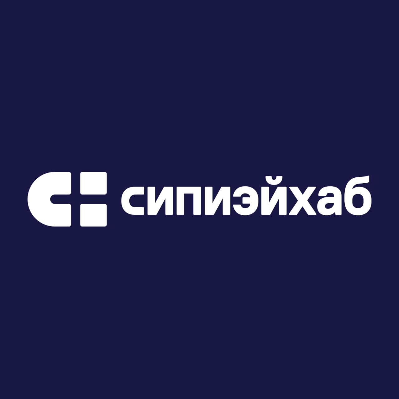
We decided to use this metaphor and turn C and H letters into the image of a magnet, to get additional link between the logo and company’s activity.
The logo got a cross in its core. It was another trick. A cross reminds us about the Swiss flag and Switzerland is the country with most reliable banks in the world. It provided the logo with links with the Banking sector.

Presentation
One of the most crucial goals was to leave CPAHUB abbreviation behind because the Russian market would not appreciate it at all.
That is why we decided to spell it with Russian letters instead. It looks smart and it is easy to remember. The English-speaking audience still has its CPA-hub option.

Later, we started selecting a font. As we were designing a logo for a company, engaged into Financial sector, it must have been simple and smart. So, we decided to apply a simple font without squiggles.
We got the following variant:

The client approved it as it looked smart, serious and reliable. Moreover, it had two more hints, effecting audience perception: the Swiss flag and a magnet. This logo has everything: pithiness, a puzzle and a metaphor.
We were glad that our designed was approved and started applying it to different businesses, spelling it in English.


In practice
Then we checked the way the logo is used in corporate social media. It looked awesome: simple, cute and easy to understand. The client was happy. We were happy.

The company started applying the logo at its website and in its social medium. By Christmas Eve they designed a new label to apply it on small corporate Christmas gifts: chocolate candy, incorporating the new logo in its packaging design.

Read the original article at VC.ru


DISCUSSION